Edward Tufte is an evangelist for the context-driven analysis and presentation of data. He self-published his first book on the topic, The Visual Display of Quantitative Information, in 1983 and followed it over the next 20 years or so by Envisioning Information, Visual Explanations, and Beautiful Evidence.
All four books are carefully-crafted exemplars of the qualities that Tufte wants us to understand and absorb into our work: that graphical content, design and style should directly serve the intent or needs of the creator and the consumer without compromising the data.
Alongside the books, he’s published a series of essays. One of them, The Cognitive Style of PowerPoint, comes at the same goal from a different angle – the consideration of how a tool can impact the veracity and quality of the message.
As a tester, as someone who will often find themselves in the position of needing to present data to others, as someone who will want to transmit that data effectively, in ways that are relevant to the audience, and in ways that don’t obscure other important information, could this be of interest to you?
I’ll take that one: yes.
There is a remarkable consistency of vision within and across Tufte’s work, and his prose positively glows when he has a strong point to make. If I’m honest, he does sometimes labour those points but it’s always for the love of design that promotes truthful reporting and ease of comprehension.
Below I’ve pulled out a few strands that run through his work and capture key aspects of his position for me. I hope he would approve of my treating his words as raw data, and trying to contextualise them just enough for a software testing audience to appreciate.
Get TestRail FREE for 30 days!
Communication
When you’re testing, you are seeking data: You might be after numbers that demonstrate the performance of an application under some defined set of conditions, trying to find conditions under which the performance is questionable, asking relevant stakeholders whether any of the conditions are of interest to them. Or you might just be exploring to understand what data to gather. (But note that the outcome of that exploration is itself data.)
Having gathered data, you will be looking to place it into a relevant context in a way that is consumable by those who need to see it – to make it into information.
We envision information in order to reason about, communicate, document, and preserve that knowledge (EI p. 33)
Visualisation is a tool and, as with the use of any tool, it helps to understand why you are using it, and to think about whether it’s appropriate. And that thinking applies at the meta level (communication, in this case) as well as the practical (how to implement that communication).
The first question is: What are the content-reasoning tasks that this display is supposed to help with? (BE p. 136)
How is it that each elaborate architecture of thought always fits exactly on one [PowerPoint] slide? (CSP p. 12)
Having declared your intent and chosen a way to fulfil it, you might turn to the question of how to show your findings in a way that’s compelling.
You’ve probably come across the term bug advocacy? You might think about information advocacy more generally; it’s easy to fire up Excel, dumbly drop your data in, push the scatterplot button and email the spreadsheet off to everyone on the project. But will this encourage your readers to engage with your information?
If the statistics are boring then you’ve got the wrong numbers. Finding the right numbers requires as much specialized skill – statistical skill – and hard work as creating a beautiful design or covering a complex news story. (VDQI p.80)
Think about this too: it’s one thing to display the information you have gathered in a way that makes it tiresome to consume but it’s quite another to obscure or, worse, distort it.
Above all else show the data. (VDQI p. 92)
When you can, consider supplying raw data alongside your analysis of it – you don’t think you’re the only person who could possibly have insight here, do you?
Comparison
Seasoned testers have a bunch of questions near the tips of their tongues at all times, ready to roll out as the need arises. Tufte is intimately familiar with one of them.
At the heart of quantitative reasoning is a single question: Compared to what? (EI p. 67)
Part of putting data in context is choosing what to set it against. Say you have performance figures for the development version of your product generated with test data in the dev environment. You fear that this build is slower than the live release, but the live build was compiled months ago on a different build server, is linked against different versions of the core libraries it depends on, has variable user data and runs in production.
What should you do?
Show comparisons, contrasts, differences. (BE p. 127)
In this example, there are multiple dimensions of difference and presumably some elements in common that motivate your fear and can be shown. Tufte strongly recommends letting the reader seeing as much of this as possible, wherever possible, formatted in a way that highlights important differences.
If the visual task is contrast, comparison, and choice – as it so often is – then the more relevant information with eyespan the better. (EI p. 50)
He cautions against making aspects of the graphics be more prominent than aspects of the data because this increases the cognitive load of the reader when trying to make relevant comparisons.
So if you have prominent labelling, heavy grid lines, an abundance of colours, different conventions for the same kind of data in different charts, different data using the same conventions, a penchant for clip art, … (Tufte could go on for days about what he terms chartjunk) you should remove or tone them down to the minimum they need to be so that the comparison that matters is visible.
Relevant to nearly every display of data, the smallest effective difference is the Occam’s razor … of information design. (VE p. 71)
Show data variation, not design variation. (VDQI p. 61)
Clarity
Sir Ernest Gowers, in his classic book on writing, The Complete Plain Words, says “What appears to be a sloppy or meaningless use of words may well be a completely correct use of words to express sloppy or meaningless ideas.” Tufte echoes this in the graphical domain.
Excellence in the display of information is a lot like clear thinking. (VE p. 141)
He puts the onus on the person creating graphics to first have clarity for themselves.
If a clear statement of the problem cannot be formulated, then that is a sure sign that the content of the presentation is deficient. (VE p. 68)
And points out that it’s also on those creators to make consumption of their content comfortable for their audience.
Graphical excellence consists of complex ideas communicated with clarity, precision, and efficiency. (VDQI p. 51)
Notice that this does not necessarily mean dumbing down or removing data. In fact, it can sometimes be the opposite. Consider that you are interested in the performance trend of one microservice in your server over time. You could simply plot that on a chart – it would be simple, but it could also beg more questions about the context in which that performance was achieved.
More informative might be to plot the performance trends of all services over time (or the mean of them, or range between the minimum and maximum of them or some other summary statistic) and clearly highlight the one you are interested in.
Simplicity of reading derives from the context of detailed and complex information, properly arranged. A most unconventional design strategy is revealed: to clarify, add detail. (EI p. 37)
For technical presentations, Tufte is particularly keen on the idea that pages of bullet points enable shallow preparation of weak content and sugar the slide deck pill for the audience too.
Writing sentences forces presenters to be smarter. And presentations based on sentences makes consumers smarter as well. (CSP p. 30)
If you want to force yourself to understand what you want to say, write it down in sentences. If you want your audience to have less chance of misunderstanding you, leave them in your slides.
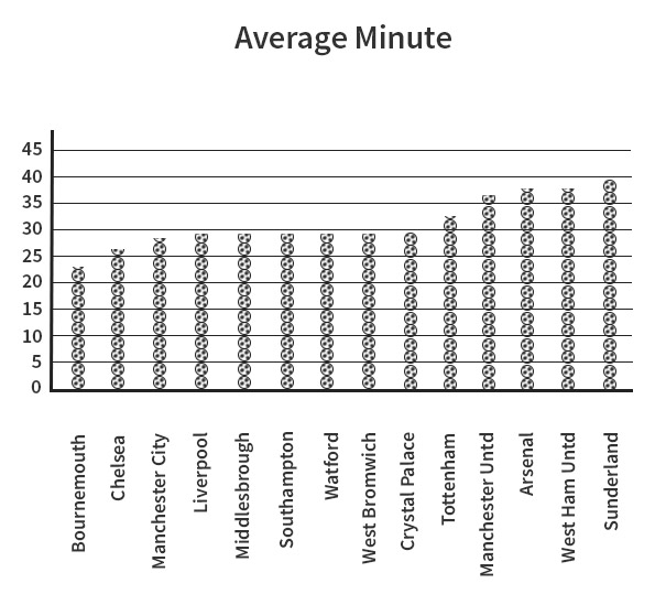
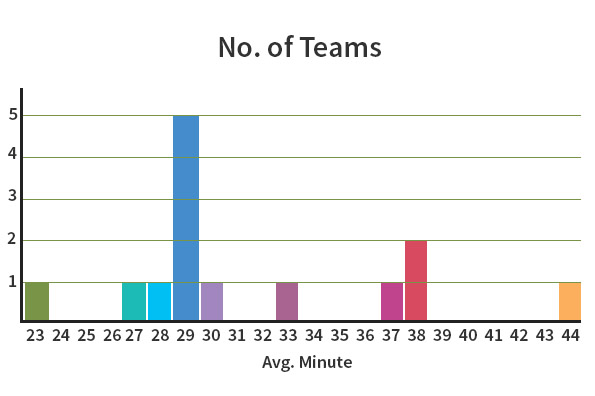
The graph above displays stacks of footballs to show the average minute in which the first goal was scored. This graph obscures its purpose by using badly-spaced, non-cumulative, non-linear arrangement of graphics. A simple bar chart would convey the message much better. The graph below is much more useful.
Join 34,000 subscribers and receive carefully researched and popular article on software testing and QA. Top resources on becoming a better tester, learning new tools and building a team.
Context
Context is the oxygen of information. If you want your information to thrive, give it a setting that promotes its correct interpretation.
Graphics must not quote data out of context. (VDQI p. 74)
For me, that covers both the wrong context and no context.
Tufte considers how to provide the right context carefully too, favouring both placing text in graphics and graphics in text (his sparklines are “words” of data), but they have to know their place.
Thus, for graphics in exploratory data analysis, words should tell the viewer how to read the design … and not what to read in terms of content. (VDQI p. 182)
Notice that it can be appropriate for the purpose of graphics to be exploration. In your testing role you may have collected, say, user retention data for an online service. You’d like to find patterns in it in order to assess whether existing business goals are being met and also to assist the business in making future strategy decisions. But you can’t find them.
In this case you might choose to present several slices of that data – remembering to be consistent across them, and deemphasizing that which is not to be compared – for others to view, in the hope that they can find relationships where you saw none. But if that is your goal, make sure that it is obvious to the audience.
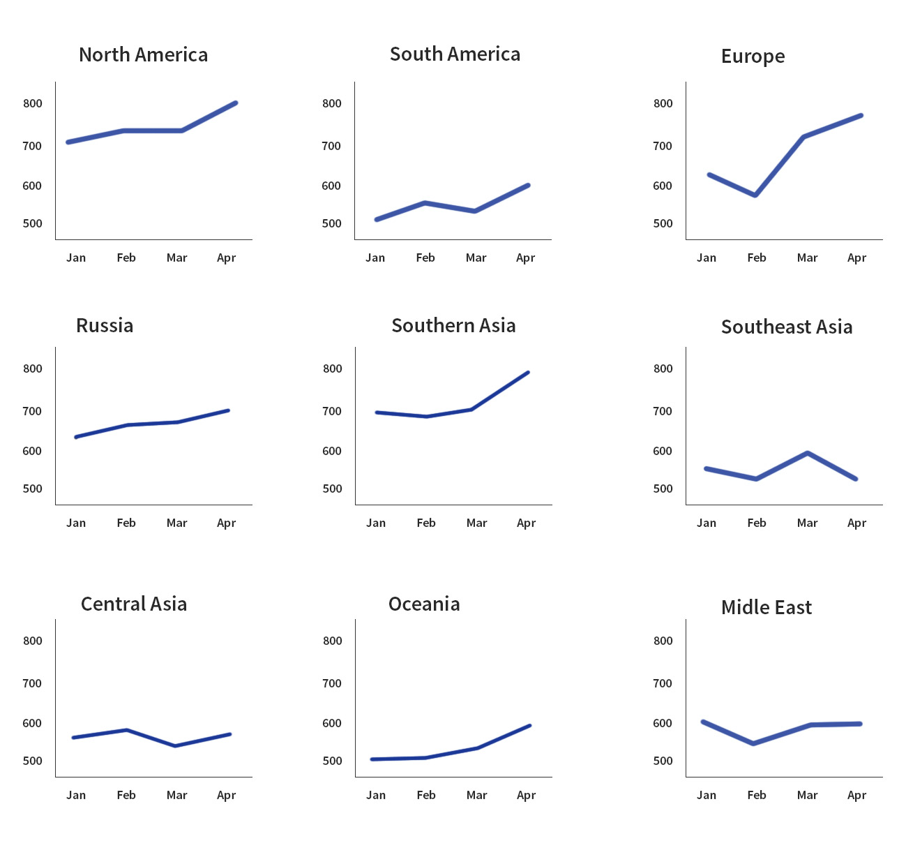
You can use graphics as context for graphics too. One of the most powerful techniques in the books, for me, was the production of arrays of small charts, rendered at a high resolution, data dense, and within the same frame of visual reference.
Multiple images reveal repetition and change, pattern and surprise – the defining elements in the idea of information. (VE p. 105)
I think it’s fair to say that, as a default position, Tufte will argue for more data over less data.
Sometimes PowerPoint’s low resolution is said to promote a clarity of reading and thinking. Yet in visual reasoning, arts, typography, cartography, even sculpture, the quantity of detail is an issue completely separate from the difficulty of reading … meaning and reasoning are relentlessly contextual. Less is bore. (CSP p. 16)
Conclusion
I come at this work from the perspective of a tester who wants to find efficient and effective ways to expose data I have collected, share my data with colleagues to benefit from their expertise in interpreting it, and present findings to stakeholders. But I think it’s generally applicable to anyone wanting to inform anyone else of anything without wasting everyone’s time.
Following Tufte’s guidance, I wondered whether I could summarise the meaning I’ve taken from this exercise, the point I’ve tried to make in this piece, in a sentence. I think I can. I think it’s in this quote from Envisioning Information:
Information consists of differences that make a difference. (p. 65)
James read The Visual Display of Quantitative Information (VDQI), Envisioning Information (EI), Visual Explanations: Images and Quantities, Evidence and Narrative (VE), Beautiful Evidence (BE) and The Cognitive Style of PowerPoint (CSP) all published by Graphics Press and available direct from the author at edwardtufte.com. With thanks to Šime for the loans and the comments.
This is a guest post by James Thomas. James is one of the founders of Linguamatics, the world leader in innovative natural language-based text mining. Over the years he’s had many roles in the company and is currently the test manager, a position in which he strives to provide an environment where his testers have an opportunity to do their best work. He’s on Twitter as @qahiccupps and blogs at Hiccupps.


