It’s been months in the works – and now it’s finally here: the completely re-designed TestRail website, with a beautiful new design and easier navigation.
What changed?
It’s more than just a visual refresh: we’ve rebuilt the entire TestRail website from the ground up.
On mobile, you’ll find that the website is now fully responsive to your device’s screen size and orientation. This means that you’ll have a great experience whether you choose to visit our website from your desktop, tablet, or phone.
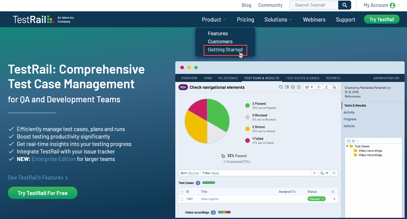
We’ve reorganized site navigation features to help you find the content you need. For example, so that new users can easily find our video training course, we’ve added a link to it from our new Product menu called “Getting Started,” as shown below. To make room at the top of the page, we’ve moved several menu options to the bottom, such as the About Us, Legal, and Terms pages.
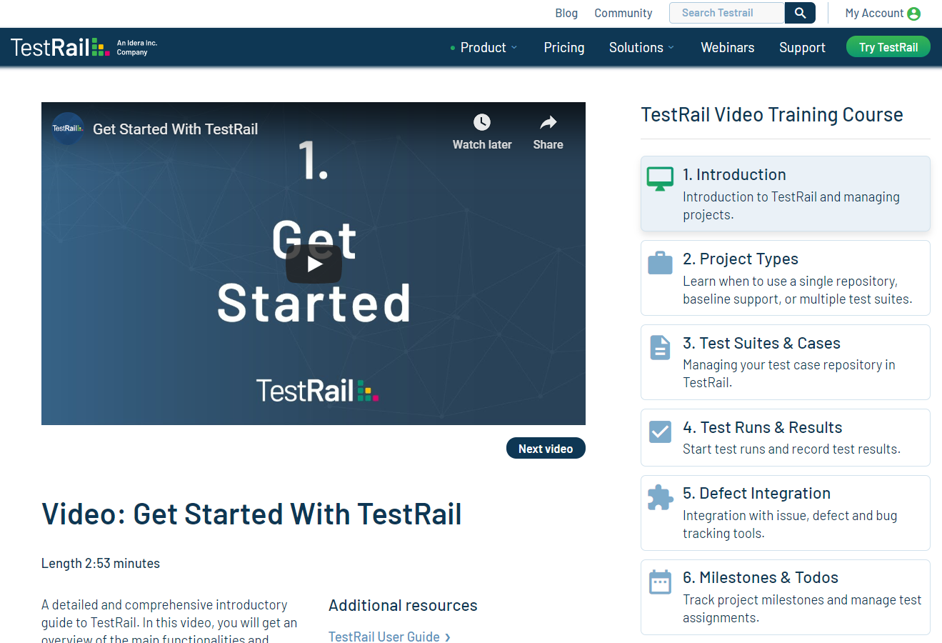
Updated Video Training Course
We’ve also updated the video training course, bringing it current for TestRail release 6.2. If you’re new to TestRail, watching the video training course is a great way to get productive quickly.
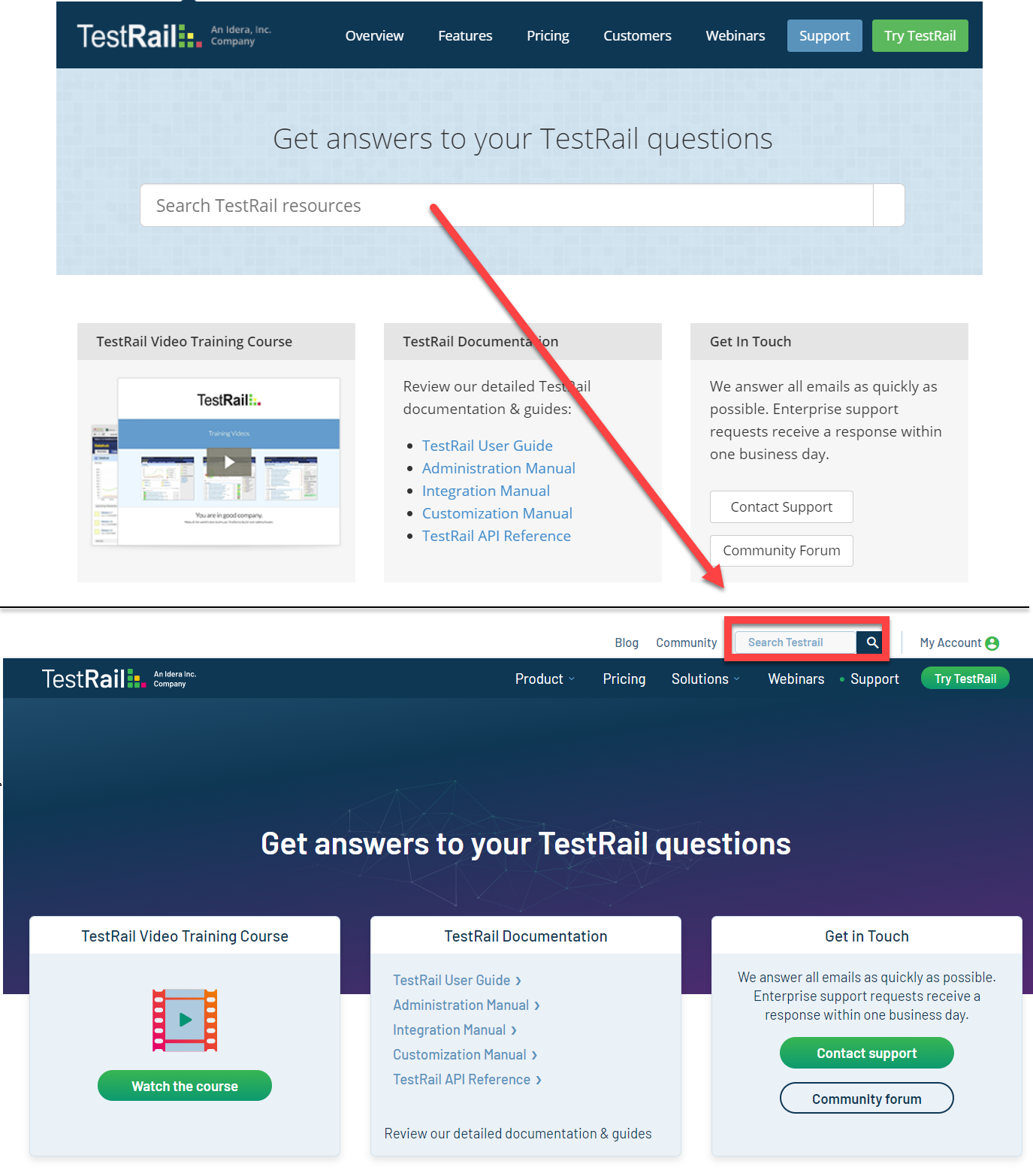
Updated Support page and Search
On our Support page, the search box has been removed, and replaced with a full-site search that you’ll find in the top menu bar:
We hope you enjoy using the new TestRail website! And we’d love to hear from you about it: just leave some feedback for us in the comments section below.


